Overview
Situation
Redesign of the website belonging to POP TikR, a local Ottawa business.
I was a part of the UX team hired to overhaul the POP TikR website. We completed the full UX design lifecycle, including user research, information architecture, wireframes, and protoyping.
Problem
Designing for a start-up like POP TikR involves a lot of brand research and development. To accommodate we extended the Research and Analysis phases.
Building a good UX solution requires a good understanding of the brand’s needs and expectations.
My Contributions
Neon Border Design
The client was looking to include "neon" elements throughout the design. In the old web design, the neon was included as a dual-tone border with sharp corners.
By using browser developer tools, I discovered that the borders were included in the webpage as PNG images. This is a pretty clunky solution that looked off and slowed down the page.
I developed and pitched a new neon border that relied on only a couple of lines of CSS.
After some advice and criticism from my team, we decided on a sleek, simple, and lightweight border design.
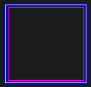
Old border design.
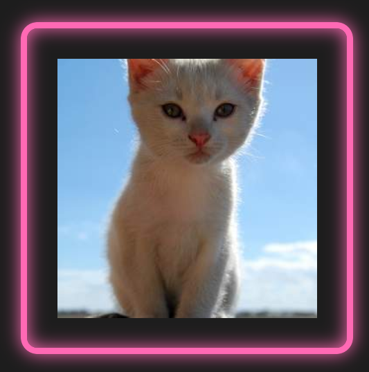
Initial border design proposal.
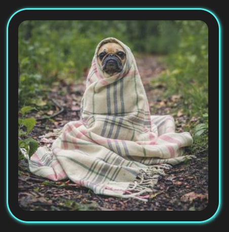
Final border design.
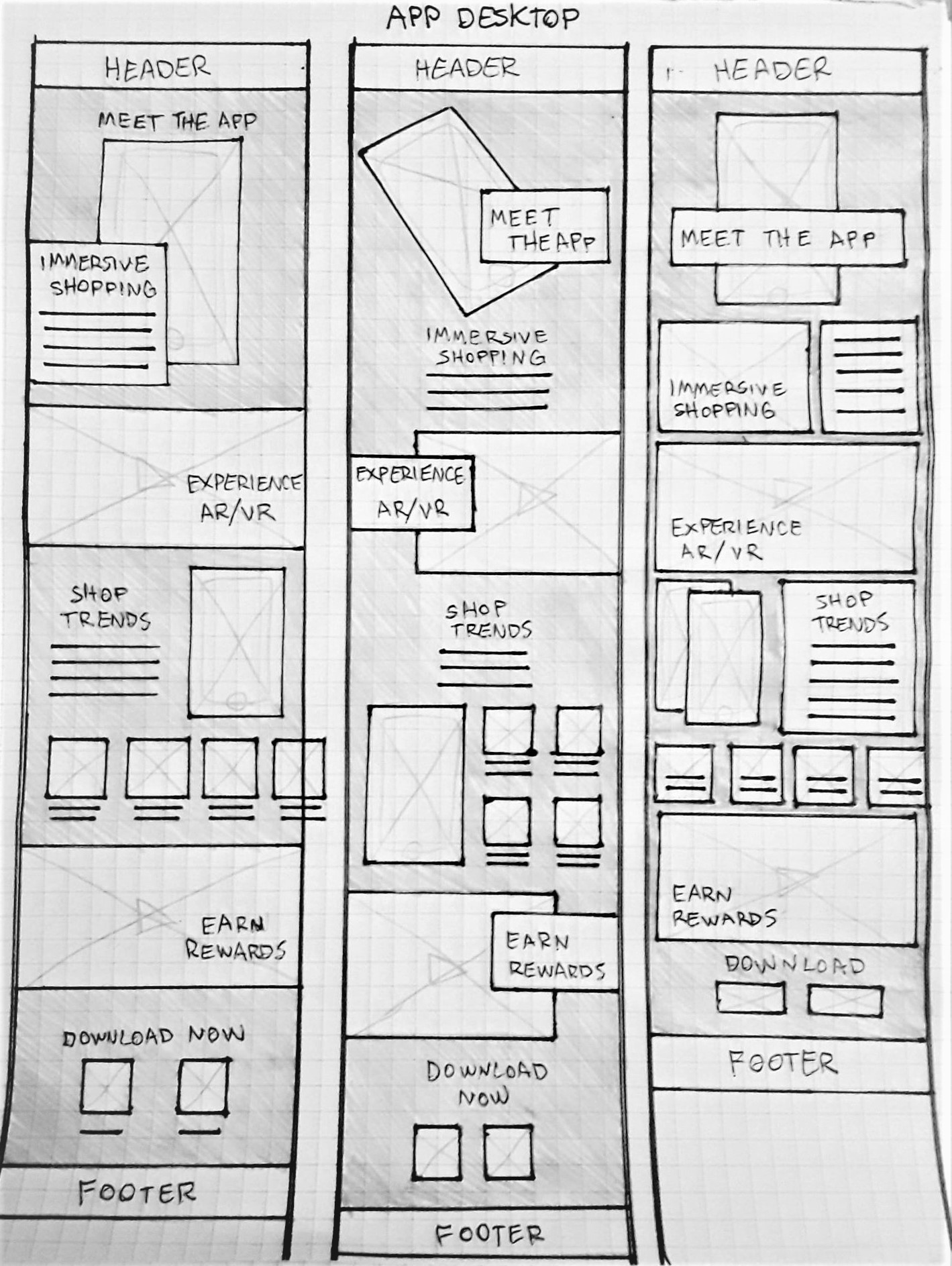
Site Architecture
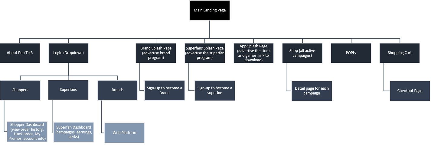
I assessed the old site architecture using Power Mapper and used it to build a new Site Architecture for the redesign.
Privacy Report
I drafted a Privacy Recommendations Report that detailed research into international and domestic digital privacy considerations specific to the needs of POP TikR.
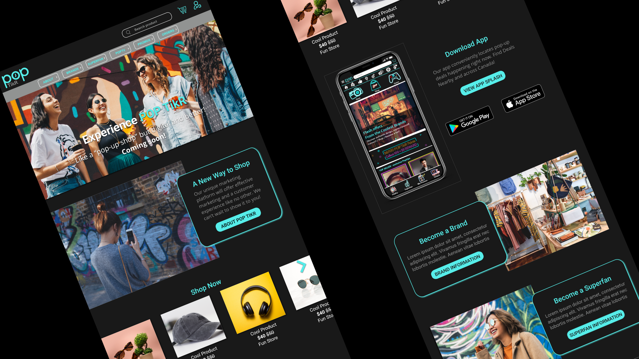
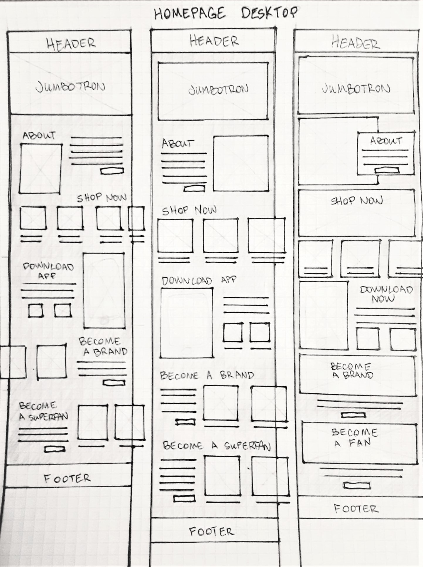
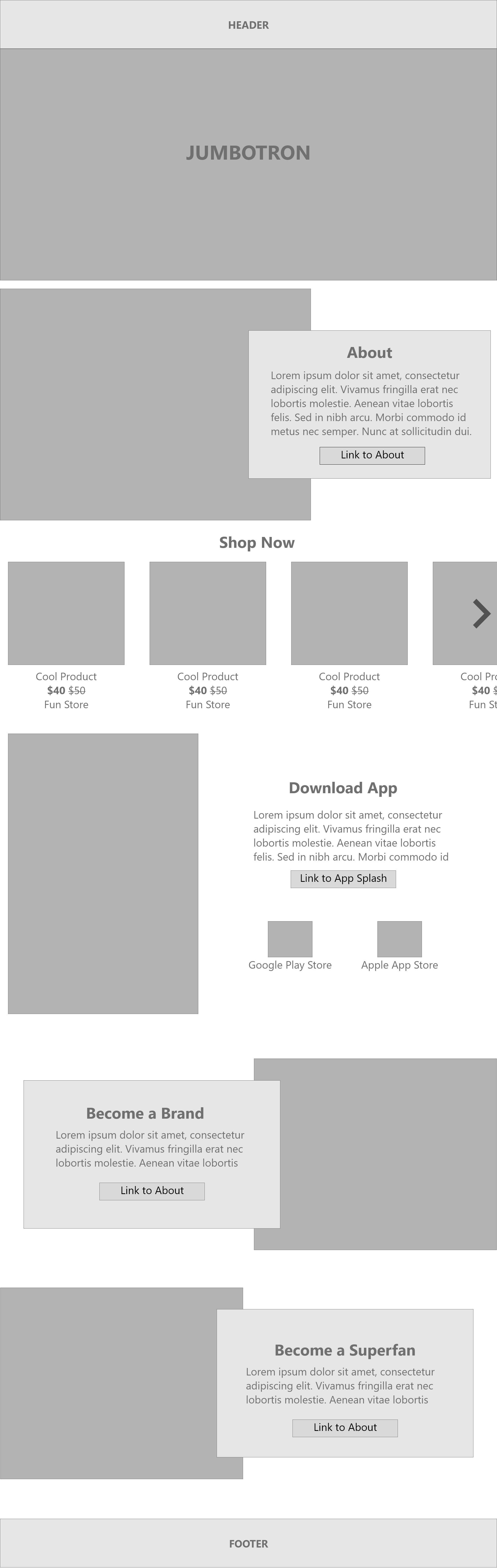
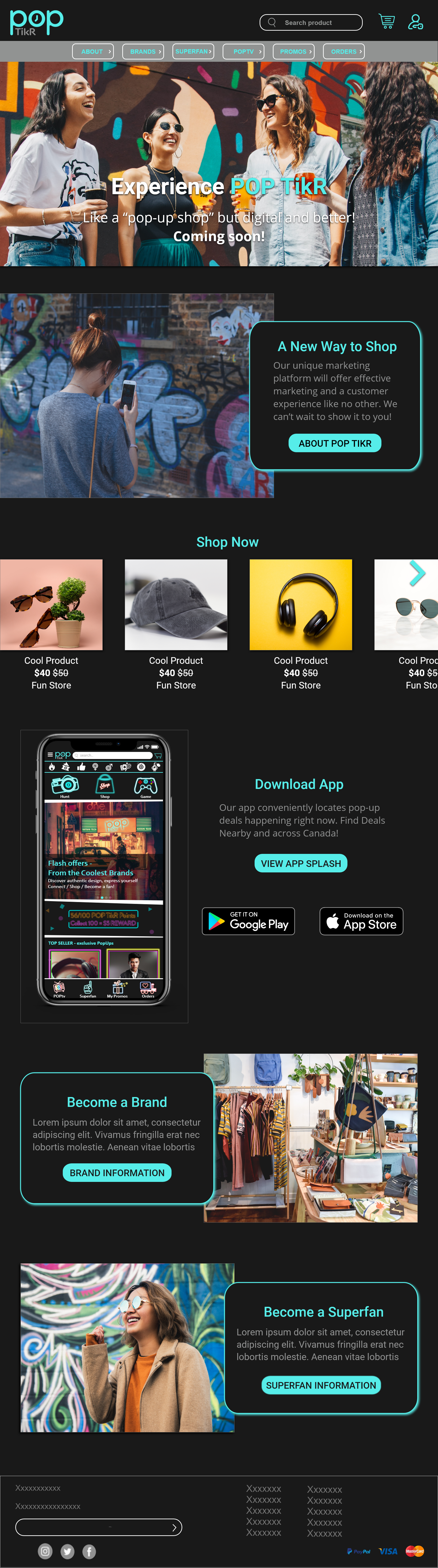
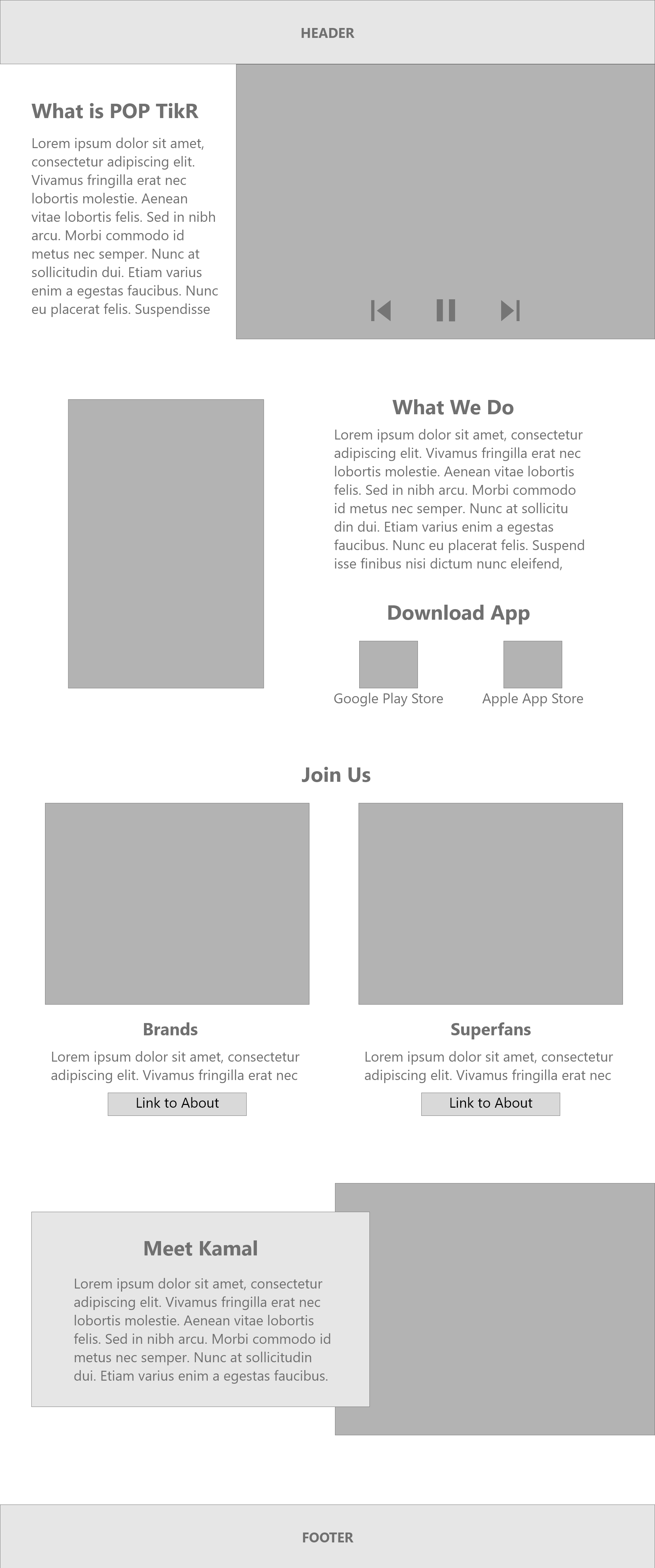
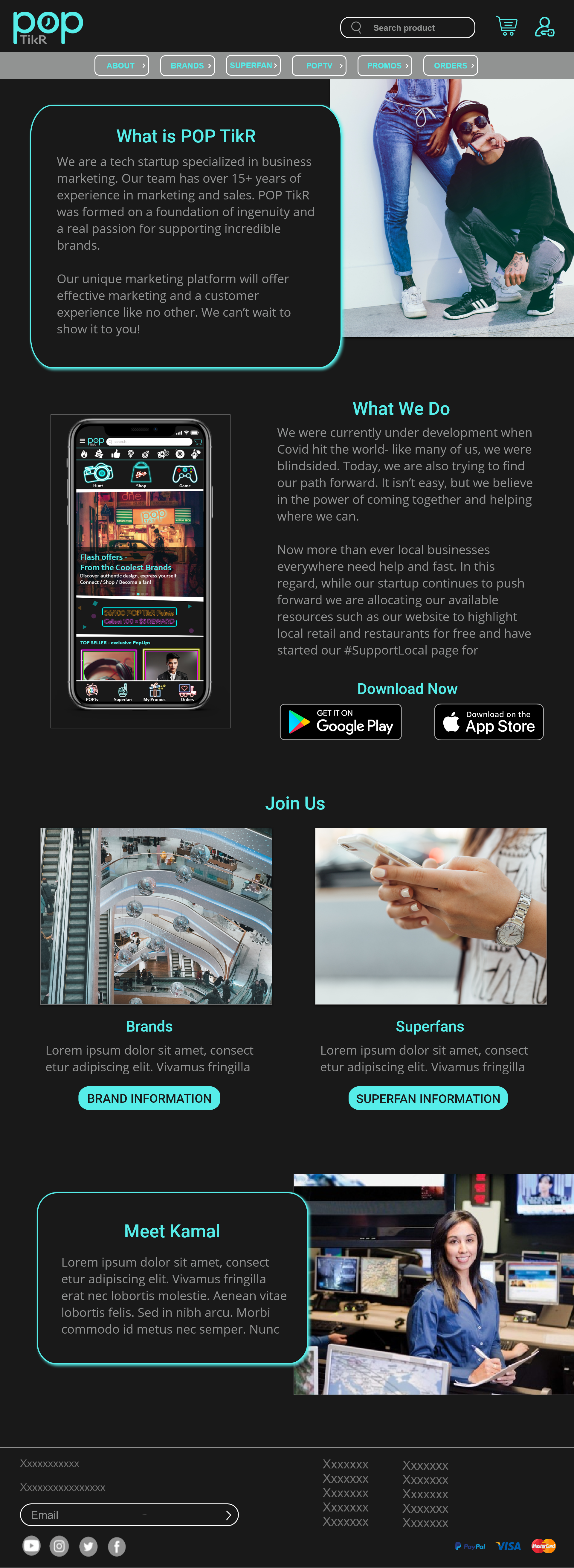
Homepage Design
I designed the homepage to highlight key calls to action and encourage the user to delve deeper into the site.
As the client requested, the page is image-heavy, and features inclusive and diverse imagery.
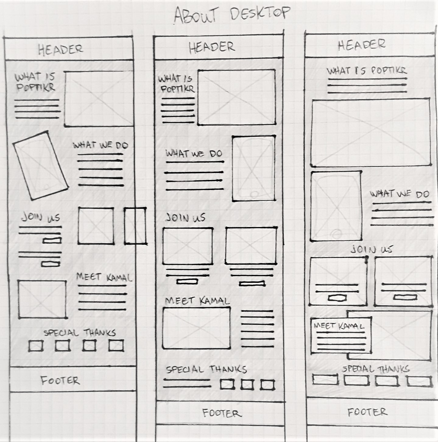
About Page Design
The About page design included special considerations, as requested by the client. This included a focus on the app (and links to download), and calls-to-action for users to join the service.
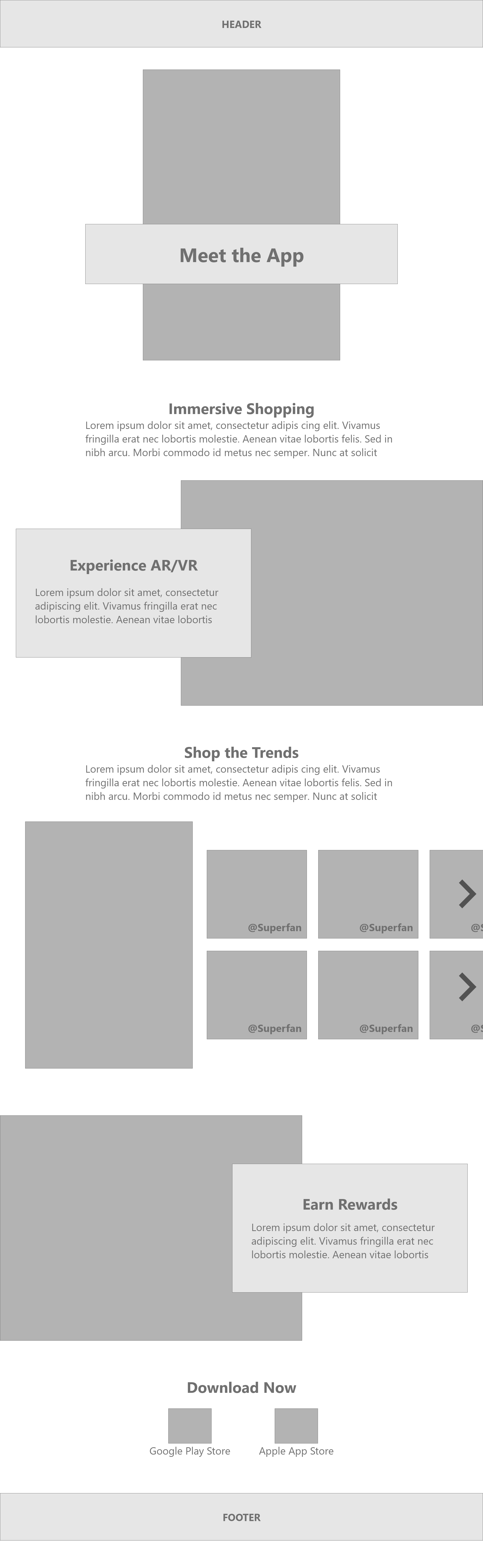
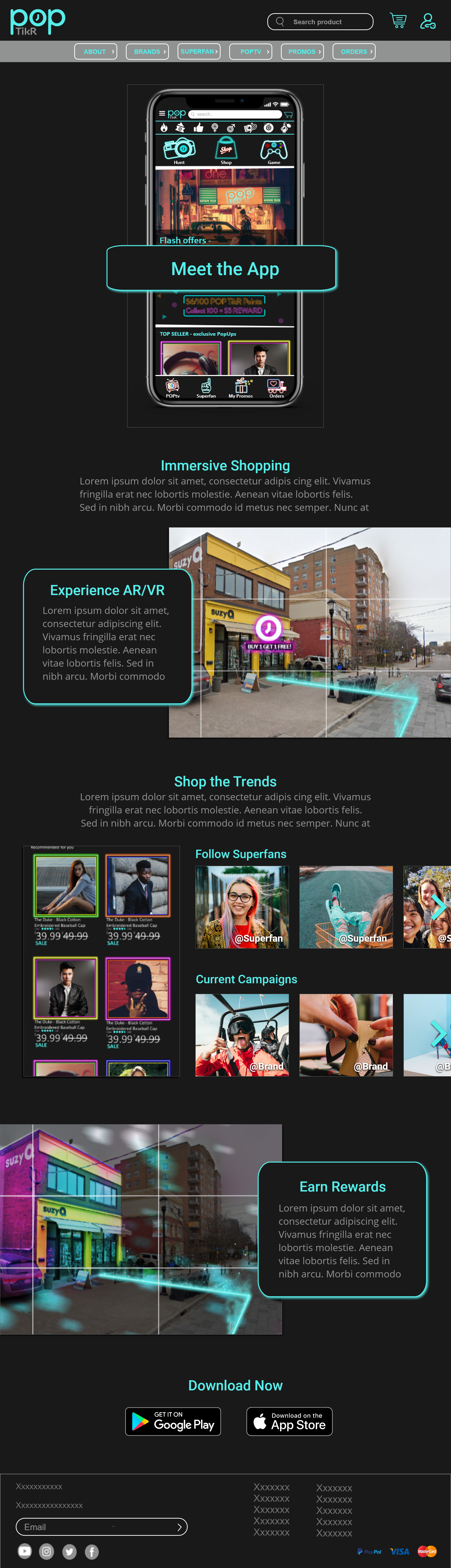
App Splash Page Design
The App Splash page includes big, bold images of the app UI, to entice users to download it.
Through consultations with the client, we worked together to add a section that showcases social media posts by app users. Encouraging user interaction.